GRAPHIC DESIGN IN WOLLONGONG
OUT OF THIS WORLD
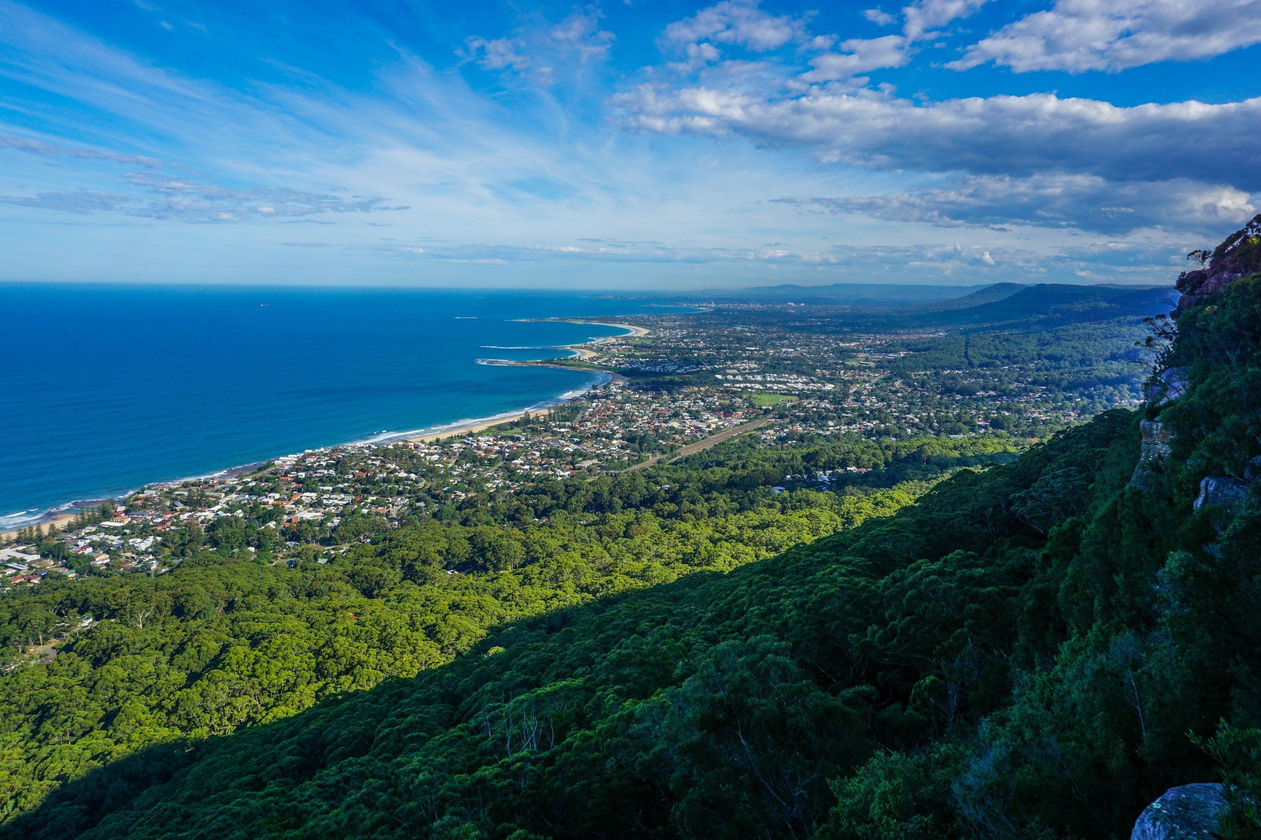
GRAPHIC DESIGN WOLLONGONG
Nestled in the heart of Wollongong’s northern suburbs, Brainwave Creative specialises in transforming ideas into captivating designs for any size business. From sleek branding solutions to marketing and advertising collateral, Brainwave Creative can help take your unique vision and make it reality.
Request a quote today and let’s work together!
LATEST PROJECTS…
Client: McGrath Foundation
Campaign Design | Collateral Design | Marketing Strategy
Every year the New Year’s Day cricket test at the SCG becomes a sea of pink in support of the McGrath Foundation and families experiencing breast cancer. This year, the McGrath Foundation reached out to Brainwave to design the supporting fundraising campaign, merchandise, and on-ground advertising for the event.
Together, with our agency partner Among Giants, we delivered the revitalised Virtual Pink Seats campaign to drive donations to the beloved charity throughout the event. The campaign ‘United in Pink’ was an overwhelming success, raising more than $6.5million for the McGrath Foundation ultimately supporting 4,600 families experiencing breast cancer. It was their most successful Pink Test ever!
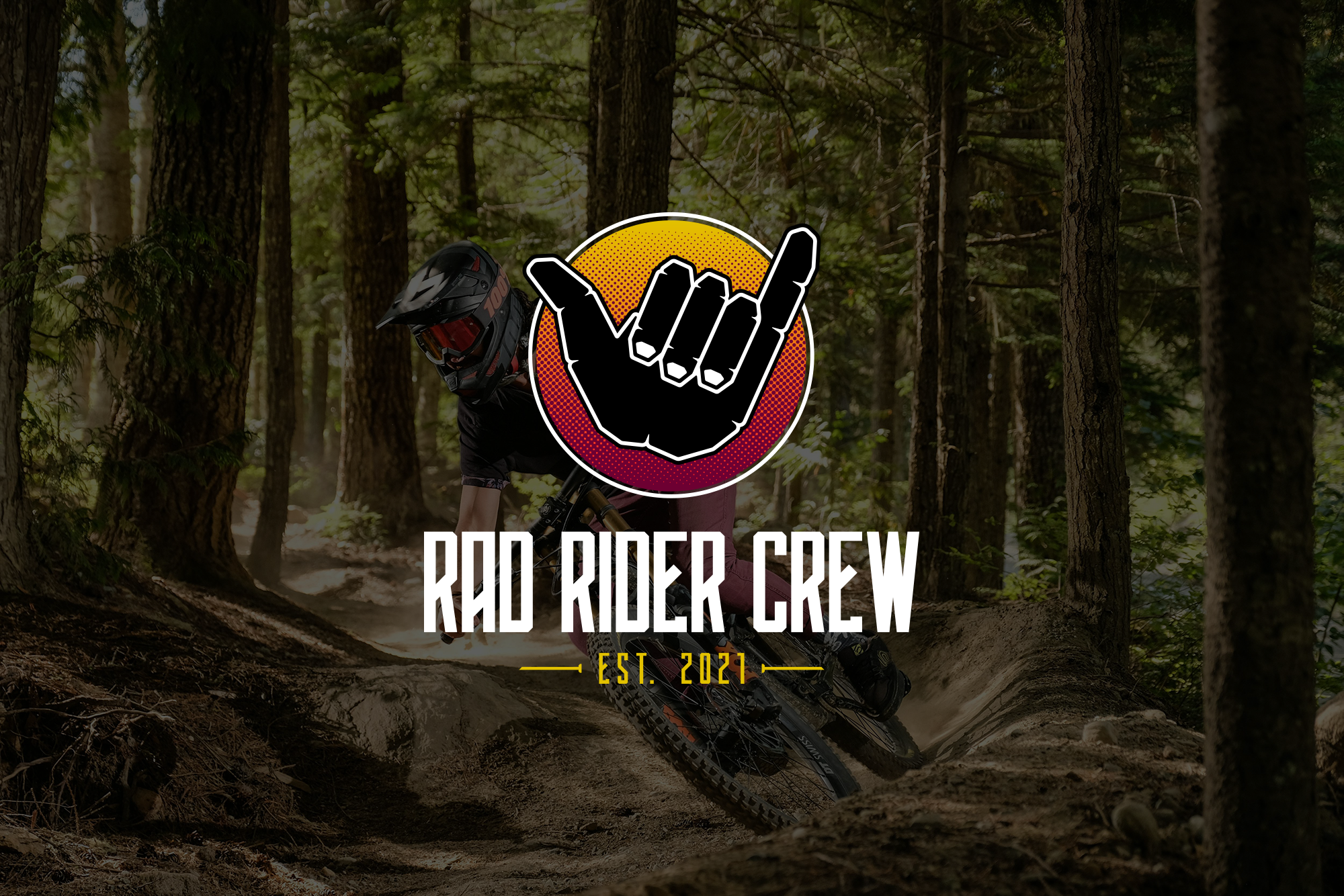
Client: Rad Rider Crew
Logo Design
Rad Rider Crew (RRC) were looking for a new logo for their popular mountain biking apparel and social media brand to establish a stronger and more legitimate brand presence in a heavily saturated market. Brainwave were “stoked” to be a part of the project and deliver a fun, bold, and rad new logo for the client.
From early conversations we discovered it was integral for the logo to keep to its roots and retain the ‘shaka’ hand symbol as the focal point of the design, whilst injecting a more modern and “radical” aesthetic in line with the industry. We created the hand with slightly sharper edges, to give it a more extreme aesthetic, overlayed on a half-tone background (in multiple colour-ways) to give it a stronger sense of depth and contrast in a saturated market.
Client: The Star Hotel
Logo Design | Brand Identity | Website
The new owners of the Star Hotel in Tumut required a new logo and brand identity to support the recent renovations they’d made to the establishment and to attract new interstate customers to the hotel.
Tumut is a town defined by its rich history in regional NSW. Characterised most notably through its stunning seasonal landscape and its heritage listed buildings dotted throughout the township. The Star Hotel is no different. The iconic heritage hotel has a stunning facade, which accompanied by the rolling hills of the surrounding landscape, was the focal point of the new logo design.
We developed a brand identity that captured the naturally beautiful landscape of the area, presenting the hotel as a destination to take in the best of what the region has to offer. Using an earthy colour palette, hand-drawn type, and artisanal imagery, we developed a brand identity and logo that didn’t just represent the hotel, but also Tumut as a destination well worth the visit.


